Services
-
Brand Identity
-
Art Direction
-
Print Collateral
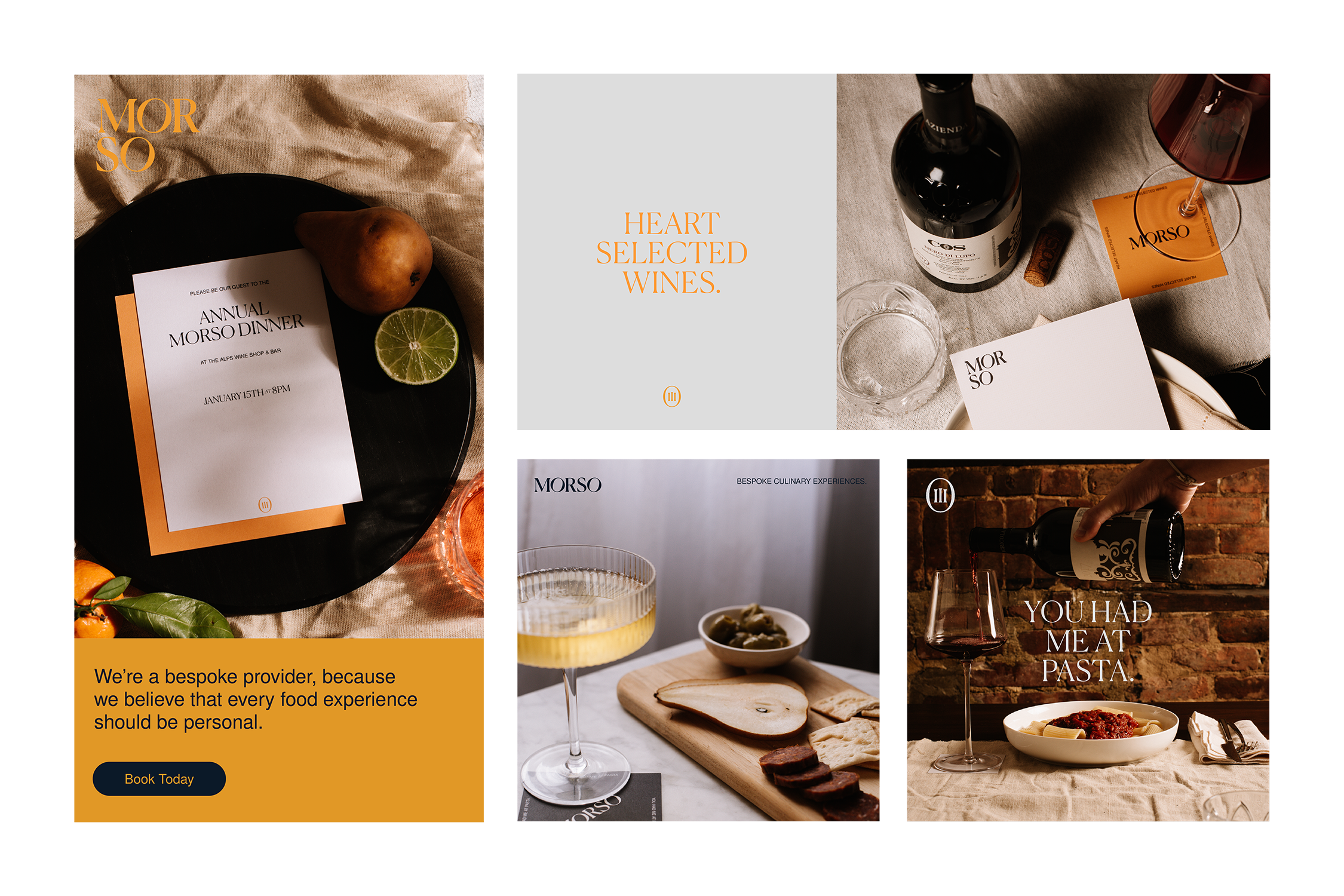
Morso offers bespoke culinary experiences, centered around delicious food and making people smile. Chatting over a bottle of wine (or two) with founder, David Powell, hearing about not only his love for food, but a passion for people, and the branding for Morso really began to take form. The storytelling of the brand was rooted in the concept, “traditions made simple.” As our conversions continued, we refined the visual language to be directed by a bespoke, intimate, and personal look and feel.
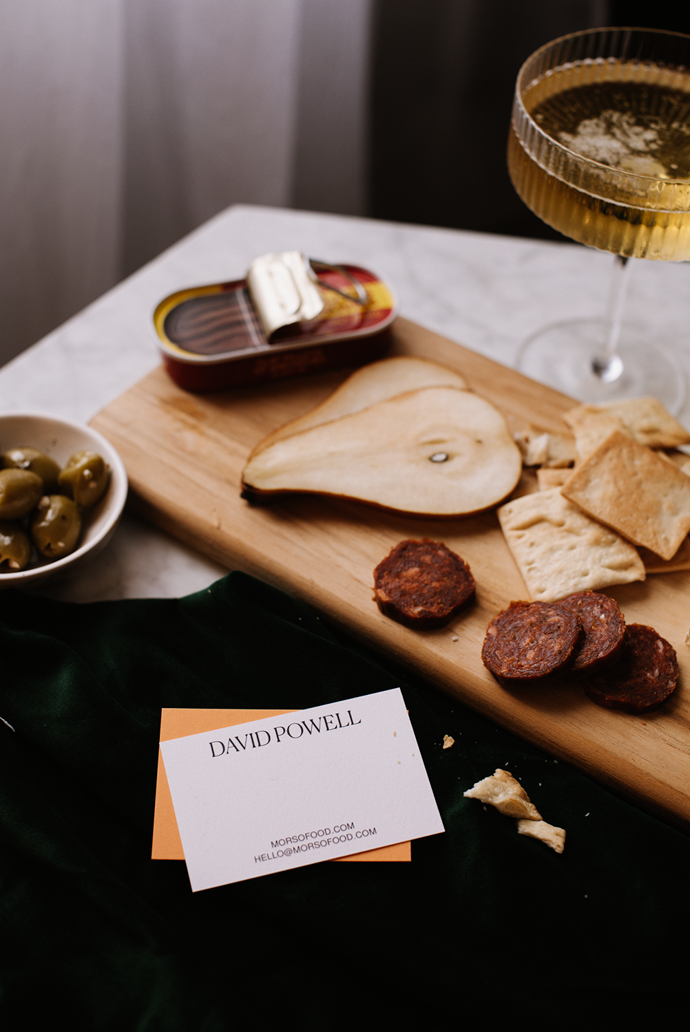
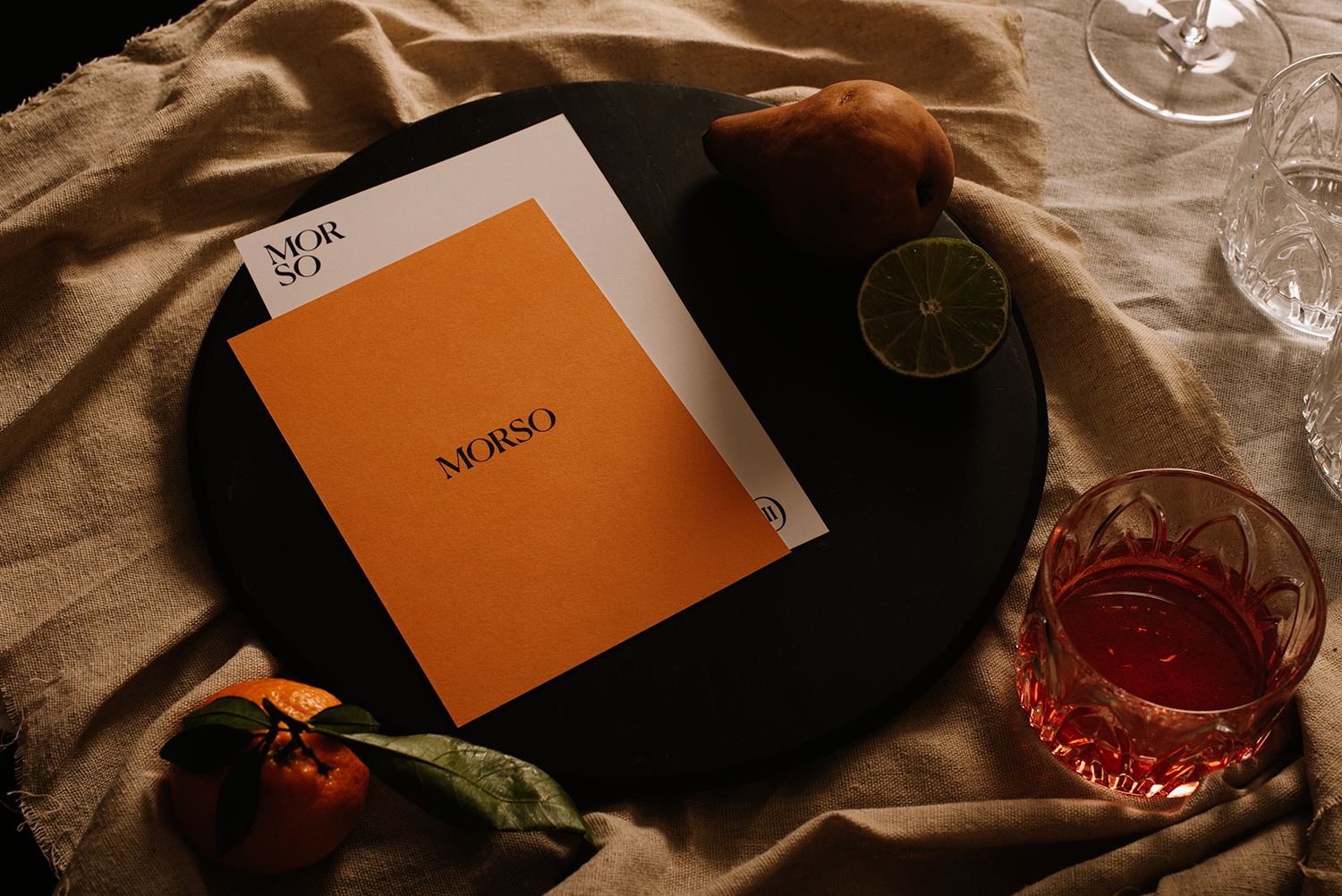
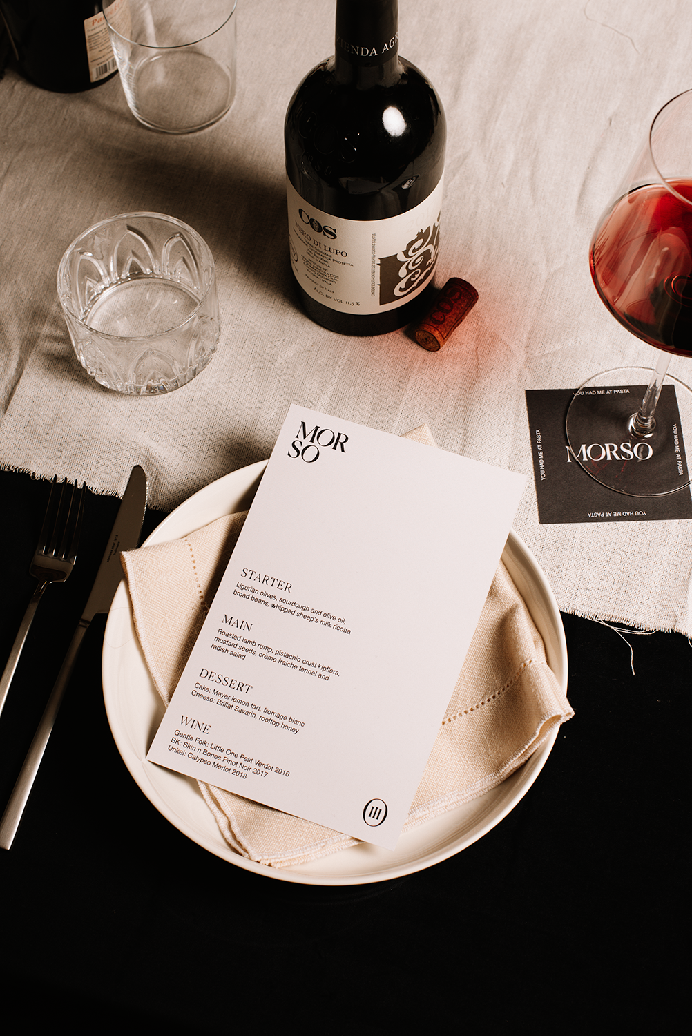
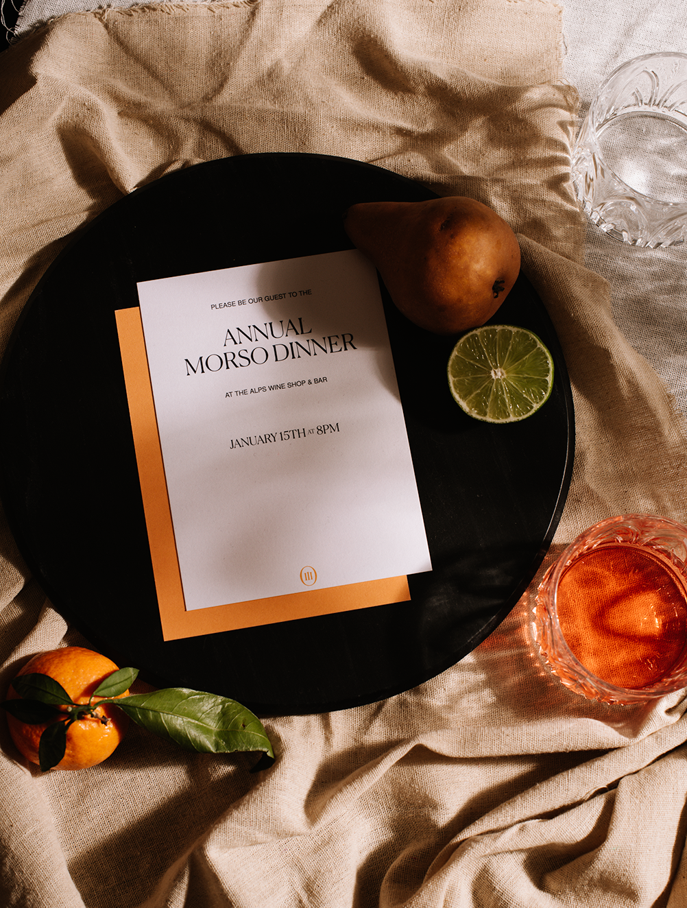
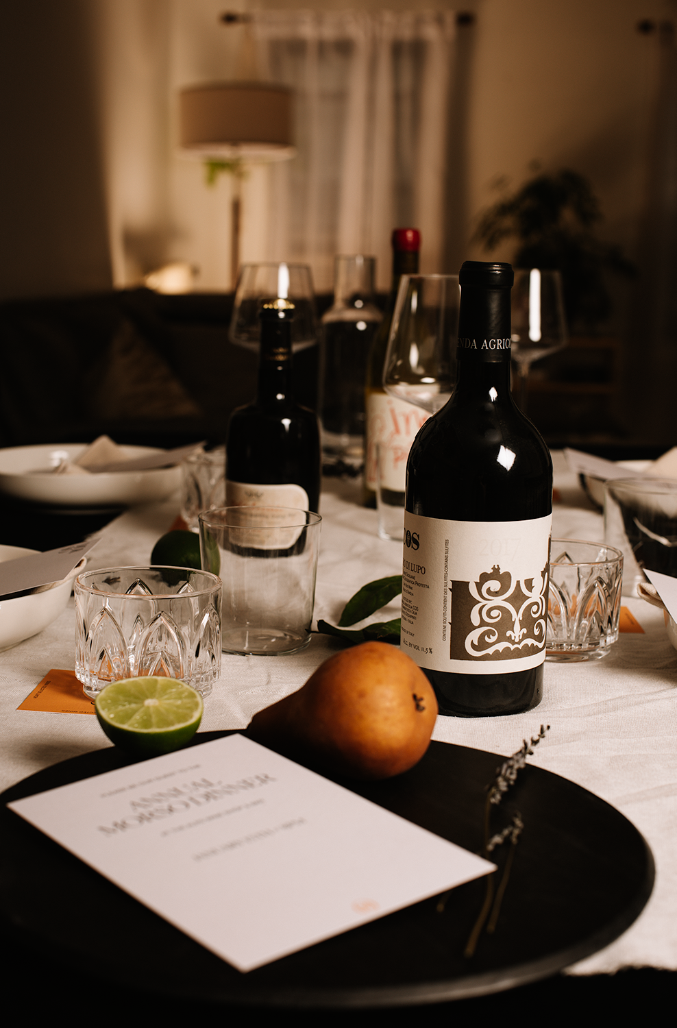
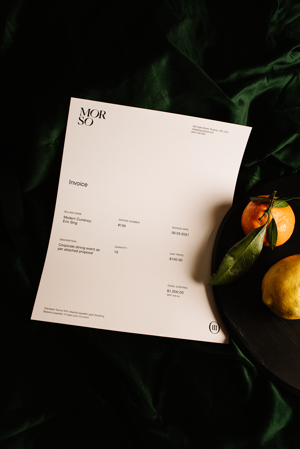
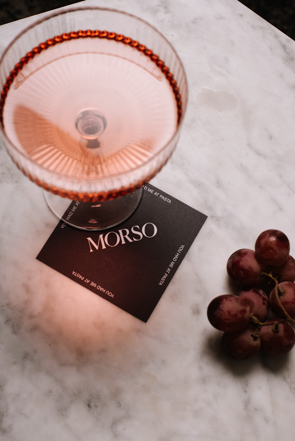
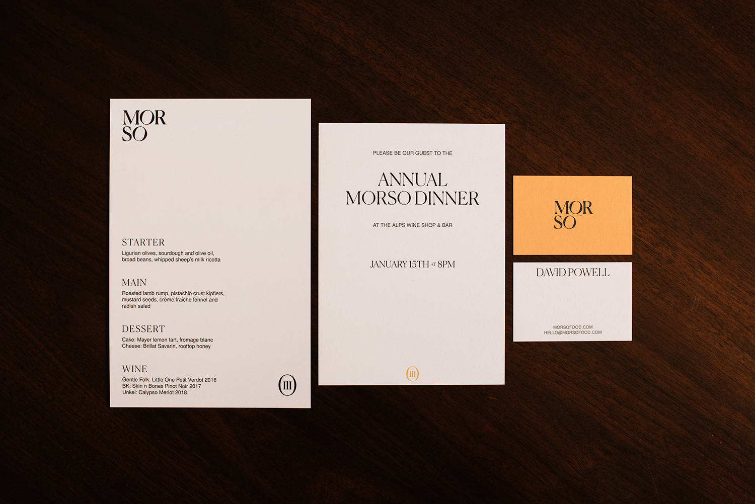
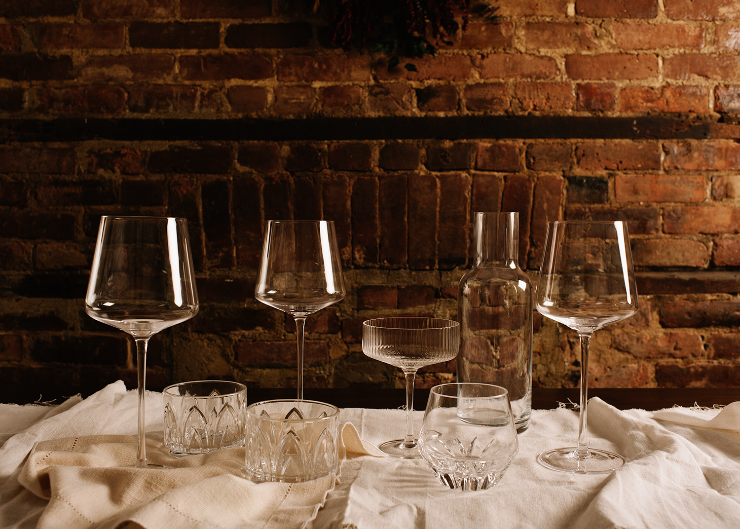
The wordmark was created with a graceful typeface that has a modern yet classic feel. For the color pallet, we chose grounded, warm colors to portray the approachability and passion of the brand. We knew the print collateral would be an important touch point so we chose an uncoated 32pt stock to capture the feeling of authenticity. Personal, unforgettable food experiences are at the center of what Morso brings to the table, and so we decided to focus our art direction on just that — the dining room table.
Morso
